Colors play a crucial role in branding. They evoke emotions, convey messages, and create a distinct identity that resonates with your target audience. Understanding how to choose the right color palette is essential for crafting a memorable and impactful brand. In this blog post, we will discuss tips for selecting the perfect color palette and answer some frequently asked questions about colors in branding.
Before diving into the selection process, it's important to grasp the concept of color psychology. Different colors can evoke different feelings and associations. For instance:
- Red: Passion, energy, and urgency. Often used in love-related products and fast-food chains.
- Blue: Trust, calmness, and reliability. Common in financial institutions and healthcare.
- Green: Growth, health, and nature. Popular among organic products and eco-friendly brands.
- Yellow: Optimism and excitement. Frequently used in children’s products and brands aiming for a cheerful vibe.
- Purple: Luxury, creativity, and wisdom. Found in premium products and creative industries.
Understanding these associations will help guide your selection process to ensure that your palette aligns with your brand's values and message.
1. Identify Your Brand Personality: Start by defining your brand's core values and personality. Is it adventurous, professional, playful, or luxurious? This foundation will narrow down your color choices.
2. Consider Your Target Audience: Think about your ideal customers. What colors resonate with them? For example, bright colors may appeal to a younger demographic, while muted tones may attract a more mature audience.
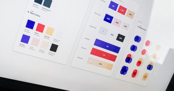
3. Limit Your Palette: A common mistake is using too many colors. Aim for a primary color, a secondary color, and some accent colors. Typically, a color palette of three to five colors works best for consistency across branding materials.
4. Test Different Combinations: Utilize color theory principles, such as complementary and analogous colors, to create aesthetically pleasing combinations. Tools like Adobe Color or Coolors can assist in visualizing different palettes.
5. Consider Versatility: Keep in mind how the colors will be used across various platforms and materials—digital, print, merchandise, etc. Ensure your chosen colors remain consistent and visually appealing in different formats.
6. Gather Feedback: Once you have a potential color palette, gather input from trusted colleagues, customers, or even conduct surveys to see how individuals perceive the colors. This feedback can guide potential adjustments.

Aim for a primary color, a secondary color, and a few accent colors. Typically, a palette of three to five colors ensures consistency without overwhelming your audience.
Can colors have different meanings in different cultures?Yes, colors can carry different meanings across cultures. It’s essential to research and understand the cultural context, particularly if your brand will operate in international markets.
What is the best way to test my color choices?Create mock-ups of your branding materials—such as business cards, websites, and social media posts—and solicit feedback from a sample of your target audience to gauge their reactions.
How can I ensure my colors look good in both print and digital formats?Be aware of color models; for digital, use RGB and for print, use CMYK. Test your colors in both formats to see how they translate and adjust accordingly for consistency.
Should I change my brand colors if they do not resonate?If you find that your current colors are not connecting with your audience, it may be worth exploring a refresh. However, consider that changes to established branding could confuse existing customers, so proceed thoughtfully.
Choosing the right color palette is an impactful step in developing a recognizable and effective brand. Take the time to carefully consider your colors, ensuring they align with both your brand identity and audience expectations. Remember that your chosen colors will be a visual representation of your brand for years to come.
Pixel Peaks is a creative agency specializing in branding, design, and digital strategy. We help businesses build strong, memorable brands that resonate with their audiences.
All author posts
Write a comment